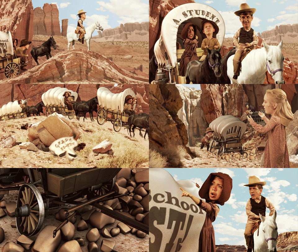
This has been one of the funnest projects that I have worked on. It has been a goal of mine for a long time to A) Work with actors on a green screen, B) Composite live action plates with CGI elements, and C) Be a part of a story telling experience from beginning to end.
Our whole team can now say they accomplished this. Everybody in the Film or Animation industry should have an opportunity to work on something similar.
We learned a lot through this project, and there were some interesting challenges that we had to overcome along the way.
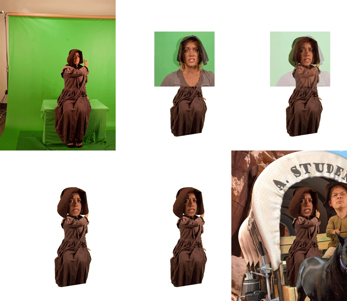
Talent and the green screen: It is best to know exactly what you need before going to the green screen. We had very limited space for our shoots, which meant that we had to be careful with our placement of the Talent in front of the screen as well as placement of the lights on the set.
We did well in this area but we didn't get everything (specifically the Talent saying ALL the lines that they need to say). This means that there was way more After Effects corrections than necessary.
Blending CGI objects into a "live action plate" with the talent: This was a pretty fun challenge and also goes back to preparations on the green screen set.
The main problem we faced here was getting rid of the shadows that were created by the folds of the greenscreen, due to us barely having enough green material to cover up everything that needed to be covered. Better preparations and a bigger budget can probably solve the problem.
Syncing voices with the talent, and fixing the mouth shapes that don't work: We had to do some clever masking effects in After Effects to work through this. The result was not quite as seamless and a lot more comical than we anticipated.
Creating an environment that doesn't actually "exist": I was fairly impressed with how we pulled this off. All of the environments exist, but not as they appear in the final composition. Each environment was pieced together from HiRes images that were taken from the Utah area.

Something that could make this work better on future projects is to label the layers making it easier to manipulate them.
Creating a digital Zoom on an environment: This was a fun little challenge required some clever use of After Effects tools and position of layers. In essence, making After Effects a digital version of Disney's Multiplane Camera.
Blending CGI animation into the mix:
The biggest challenge was with rendering and figuring out the best way to render everything.
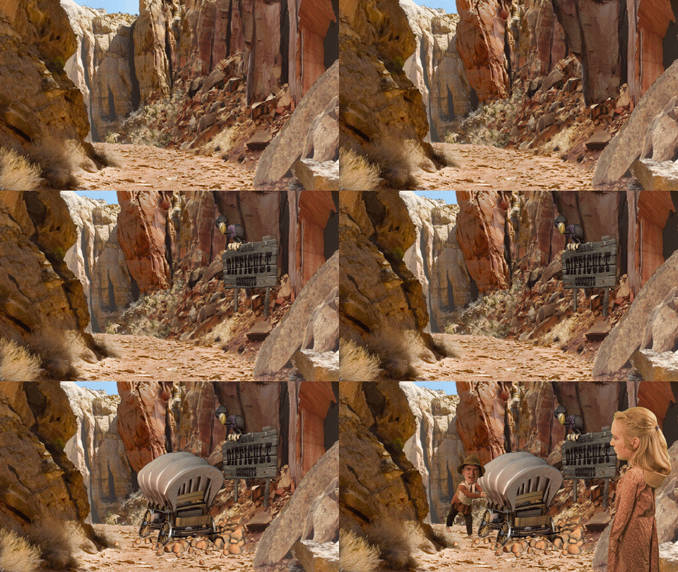
It was also a minor challenge to figure out exactly how the Talent would interact with the CGI elements. Normally you would have a live action plate that you would have to fit the CGI elements into, but we did it somewhat the opposite way here.
This was only a minor challenge, but it was never completely solved, which is OK because it works with the style. We tried to make it consistent by having a guide from the beginning that would show the size difference. We also only sized down the bodies, thus helping maintain the integrity of the images.
There were other challenges that weren't fixed very well or could have been done better:
Lighting consistency: As we had to work with talent individually and on different days, the lighting wasn't always very consistent (i.e. the professor on a saddle and the Sam and Becky on the wagon). The problem was primarily with limited room on the set and awkward shadows.
Work around: A way to solve this problem might be to situate the screen in a more neutral location in the room, and mark where lights should be on the floor.
Camera limitations: The camera we used didn't have the ability to take rapid pictures, which made it difficult to capture all of the expressions and the poses of the Talent. It was especially difficult to capture all of the horses movements.
Work around: One idea is to have them wear a "Big Head" shaped sphere and perform to that. Another less embarrassing way might be to let them imagine themselves with a larger head while doing their motions.
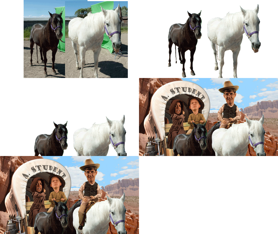
Work around: One way could be to put the screen on a wheel system to be able to role it behind the horse, at which ever angle the camera needed. Another way is to find bigger green screen surface.
"Big Head" style: Since we were pressed for time, we had to hurry through some parts of the process and this also included the way the heads were connected to the bodies. Therefore, the style was very inconsistent.
Work around: One way would be to do a couple of master poses of the Talent in extreme positions and have the lead place the head and body in the right positions with a fluid transition between the too. This would also require close collaboration between everybody involved with this part of the process.
Ending on a high note:
One thing that was particularly helpful was to have very well made CGI assets, that were both well modeled and textured. This made allowed a lot of freedom in our placing them into the scene, and allowing us to come really close to the camera and not lose much quality.
The only thing that could have been better with this is to get rid of some of the assets from the wagon, to speed up render time. The wagon was well done, and all the pieces would be great for a demo reel, but they weren't all necessary for the project cause we never really looked inside the wagon.

1 comment:
Good day. I like your wagons. Maybe you come work for me in my home country, and I pay you?
Post a Comment